Configurable Widgets
Introduction
VCMI has capabilities to change some UI elements in your mods beyond only replacing one image with another. Not all UI elements are possible to modify currently, but development team is expanding them.
Elements possible to modify are located in config/widgets.
Tutorial
Let's take extendedLobby mod from vcmi-extras as an example for VCMI-1.4. Example sources.
You can take all assets from this tutorial from sources.
This submod offers extended options while player creates new game. For random map tab it defines UI to select RMG template, select map size bigger than XL, configure teams and roads. For options tab it introduces UI for chess timers.
In this tutorial we will recreate options tab to support chess timers UI.
Creating mod structure
To start making mod, create following folders structure;
File mod.json is generic and could look like this:
After that you can copy extendedLobby/ folder to mods/ folder and your mod will immediately appear in launcher but it does nothing for now.
Making layout for timer
Let's copy config/widgets/optionsTab.json file from VCMI folder to content/config/widgets/ folder from our mod.
It defines UI for options tab as it designed in original game, we will keep everything related to player settings and will modify only timer area.
It's important, that when you are modifying optionsTab.json, game restart is not needed! When you updated file, it's enough to go back to main menu and then open lobby and options again. However, when you add new assets (images), you have to restart game to make possible find them.
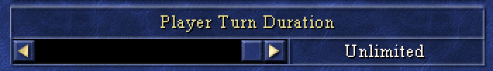
It looks like on image below and has 3 elements: label with "Player Turn Duration", label with timer duration ("Unlimited" on picture) and slider to control timer.
So we need to modify turn duration label and add combo box with timer types
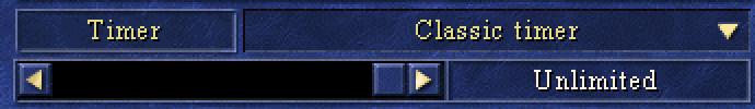
Open optionsTab.json and scroll it until you see comment timer. Three elements after this comment are related to timer.
Let's find first element, which is label
And modify it a bit
But we also need proper background image for this label. Add image widget BEFORE labelTimer widget:
In order to make it work, add file RmgTTBk.bmp to content/sprites/
Elements named labelTurnDurationValue and sliderTurnDuration we will keep without change - they are needed to configure classic timer.
Adding combo box
Now, let's add combo box.
Copy image DrDoCoBk.bmp to content/sprites/. Button objects use animated images to show different button states.
For normal, pressed, blocked and highlighted. Our combo box inherits this behavior, so let's convert image to animation.
In order to do it, we need to create file DrDoCoBk.json in same folder content/sprites/ with following content:
Thus we created file with animation, containing single frame which can be used for combo box.
Let's add one more element after //timer comment:
imageOrder helps VCMI to understand, which frame from animation to use in normal, pressed, blocked and highlighted states. In our case they will be same and we use 0 frame from DrDoCoBk animation.
We also want to have label on the top of this combo box showing which element is selected. You need to add items array, where additional elements can be specified, label in our case:
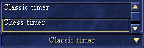
With that we already have desired layout with all elements shown by default, but we also need to add elements with timer modes into drop-down list:
First of all, add images to content/sprites/ folder: List2Bk.bmp for drop-down background and List10Sl.bmp for element highlighting.
Now specify items inside dropDown field
Now we can press drop-down menu and even select elements.
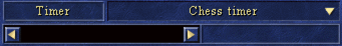
Switching timer modes
After view part is done, let's make behavioural part. Let's hide elements, related to classic timer when chess timer is selected and show them back if classic selected.
To do that, find "variables" part inside optionsTab.json and add there "timers" array, containing 2 elements:
Now we show and hide elements, but visually you still can some "artifacts":
It's because options tab background image we use has those elements drawn. Let's hide them with overlay image timchebk.bmp.
It should be drawn before all other timer elements:
This background must be visible for chess timer and hidden for classic timer. Just put its name "timerBackground" into "hideWidgets" and "showWidgets" for corresponding elements.
It works and can switch elements, the only missing part is chess timer configuration.
Chess timer configuration
We should add text input fields, to specify different timers. We will use background for them timerField.bmp, copy it to content/sprites/ folder of your mod.
There are 4 different timers: base, turn, battle and creature. Read about them here: https://github.com/vcmi/vcmi/issues/1364 We can add editors for them into items list, their format will be following:
Add three remaining elements for different timers by yourself. You can play with all settings, except callback. There are 4 predefined callbacks to setup timers:
parseAndSetTimer_baseparseAndSetTimer_turnparseAndSetTimer_battleparseAndSetTimer_creature
And what we want to do is to hide/show those fields when classic/chess times is selected. Just add names of those elements into corresponding variables "showWidgets", `"hideWidgets".
We are done! You can find more information about configurable UI elements in documentation section.
Documentation
Types
All fields have format "key": value
There are different basic types, which can be used as value.
Primitive types
Read JSON documentation for primitive types description: https://www.json.org/json-en.html
Text
Load predefined text which can be localised, examples:
"vcmi.otherOptions.availableCreaturesAsDwellingLabel"
"core.genrltxt.738"
Position
Point with two coordinates, example:
{ "x": 43, "y": -28 }
Rect
Rectangle ares, example:
{ "x": 28, "y": 220, "w": 108, "h": 50 }
Text alignment
Defines text alignment, can be one of values:
"center", "left", "right"
Color
Predefined colors:
"yellow", "white", "gold", "green", "orange", "bright-yellow"
To have custom color make an array of four elements in RGBA notation:
[255, 128, 0, 255]
Font
Predefined fonts:
"big", "medium", "small", "tiny", "calisto"
Hint text
Hint text is a pair of strings, one is usually shown in status bar when cursor hovers element, another hint while right button pressed. Each of elements is a Text
If one string specified, it will be applied for both hover and help.
"text"
Shortcut
String value defines shortcut. Some examples of shortcuts:
"globalAccept", "globalCancel", "globalReturn","globalFullscreen", "globalOptions", "globalBackspace", "globalMoveFocus"
Full list is TBD
[VCMI-1.4] Player color
One of predefined values:
"red", "blue", "tan", "green", "orange", "purple", "teal", "pink"
Configurable objects
Configurable object has following structure:
items - array of widgets to be created. Widgets are created in sequentially in same order as they described.
variables - variables, which can be used by object. Meaningful variable names are predefined for each object
customTypes - description of custom widgets, which can be used for this object, see Custom widgets
library - same as above, but custom widgets are described in separate json, this parameter should contain path to library json is specified
Basic widgets
Label
"type": "label"
"name": "string" optional, object name
"font": font
"alignment": alignment,
"color": color,
"text": text,
"position": position,
"maxWidth": int` optional, trim longer text
[VCMI-1.4] Multi-line label
"type": "multiLineLabel"
"name": "string" optional, object name
"font": font
"alignment": alignment,
"color": color,
"text": text,
"position": position
"rect": rect //text area
"adoptHeight": bool //if true, text area height will be adopted automatically based on content
Label group
"type": "labelGroup"
"name": "string" optional, object name
"font": font
"alignment": alignment,
"color": color,
"items": [] array of elements
Label group item
"position": position
"text": text,
TextBox
"type": "textBox"
"name": "string" optional, object name
"font": font
"alignment": alignment,
"color": color,
"text": text,
"rect": rect
Picture
"type": "picture"
"name": "string" optional, object name
"position": position
"image": string, specify filename
"visible": bool, optional
"playerColored", bool, optional, if true will be colorised to current player
Image
Use to show single frame from animation
"type": "image"
"name": "string" optional, object name
"position": position
"image": string, specify filename, animation only (def, json)
"group": integer optional, specify animation group
"frame": integer optional, specify animation frame
Texture
Filling area with texture
"type": "texture"
"name": "string" optional, object name
"image": string, specify filename
"rect": rect
TransparentFilledRectangle
"type": "transparentFilledRectangle"
"name": "string" optional, object name
"color": color fill color of rectangle (supports transparency)
"colorLine": color optional, 1px border color
"rect": rect
Animation
"type": "animation"
"name": "string" optional, object name
"position": position
"image": string, specify filename, animation only (def, json)
"repeat": bool, play only once or repeat animation
"group": integer optional, specify animation group
"alpha": integer optional, specify alpha opacity
"callback": string optional, callback to be called after animation complete
"frames": [] optional, array of frame ranges to show
Frame range
"start": integer, first frame
"end": integer, last frame
[VCMI-1.4] Text input
"type": "textInput"
"name": "string" optional, object name
"rect": rect
`"backgroundOffset": position
"background": string, specify filename
"font": font
"alignment": alignment,
"color": color,
"text": string optional, default text. Translations are not supported
"position": position
"help": hint
"callback": string optional, callback to be called on text changed. Input text is passed to callback function as an argument.
Button
"type": "button"
"name": "string" optional, object name
"position": position
"image": string, specify filename, animation only (def, json)
"help": hint
"imageOrder": [] array of 4 integers, each is responsible for frame to be shown in different states: normal, pressed, blocked and highlighted
"borderColor": color, optional
"hotkey": shortcut, optional
"callback": string optional, callback to be called on press. No arguments are passed to callback function.
"items": [] array of widgets to be shown as overlay (caption label, for example)
Toggle button
"type": "toggleButton"
"name": "string" optional, object name
"position": position
"image": string, specify filename, animation only (def, json)
"help": hint
"imageOrder": [] array of 4 integers, each is responsible for frame to be shown in different states: normal, pressed, blocked and highlighted
"callback": string optional, callback to be called on selection. Toggle identifier is passed to callback function as an argument.
"selected": bool, optional, is selected by default
"items": [] array of widgets to be shown as overlay (caption label, for example)
Toggle group
Group of toggle buttons, when one is selected, other will be de-selected
"type": "toggleGroup"
"name": "string" optional, object name
"position": position
"callback": string optional, callback to be called when one of toggles is selected
"items": [] array of toggle buttons
Slider
"type": "slider"
"name": "string" optional, object name
"position": position
"size": integer size in pixels
"style": string, can be "brown" or "blue"
"itemsVisible": integer, how many items are visible
"itemsTotal": integer, how many items in total
"selected": integer, current state for slider
"orientation" string, can be "horizontal" or "vertical"
"callback": string callback to be called on state change. Slider position is passed to callback function as an argument.
"scrollBounds": rect, optional
"panningStep": integer, optional
Combo box
"type": "comboBox"
"name": "string" optional, object name
"position": position
"image": string, specify filename, animation only (def, json)
"help": hint
"imageOrder": [] array of 4 integers, each is responsible for frame to be shown in different states: normal, pressed, blocked and highlighted
"borderColor": color, optional
"hotkey": shortcut, optional
"items": [] array of widgets to be shown as overlay, for example, label
"dropDown" : {} description of drop down menu widget
Drop down
Used only as special object for combo box
"items": [] array of widgets to be built. Usually contains background picture, slider and item elements.
Item elements
"type": "item"
"name": "string" optional, object name
"position": position
"items": [] array of overlay widgets with certain types and names:
"name": "hoverImage","type":picture - image to be shown when cursor hovers elements"name": "labelName","type":label - element caption
Callbacks
sliderMoveconnect to slider callback to correctly navigate over elements
Layout
"type": "layout"
"name": "string" optional, object name
High-level widgets
Custom widgets
For developers
While designing a new element, you can make it configurable to reuse all functionality described above. It will provide flexibility to further changes as well as modding capabilities.
Class should inherit InterfaceObjectConfigurable.
InterfaceObjectConfigurable doesn't have default constructor, but has possibility to specify arguments to be passed to CIntObject.
To make new object work, it's sufficient to define constructor, which receives const reference to JsonNode.
Callbacks
Custom widgets
You can build custom widgets, related to your UI element specifically. Like in example above, there is Item widget, which can be also used on JSON config.
You have to define function, which takes JsonNode as an argument and return pointer to built widget
After that, if your JSON file has items with type "MyItem", the new Item element will be constructed.
Variables
After calling build(config) variables defined in config JSON file become available. You can interpret them and use in callbacks or in element code